
Kershaw County Chamber of Commerce: A Civic Rebrand
A strong mark, built to lead a county institution forward.
The Challenge: A Logo That Read Commercial, Not Civic
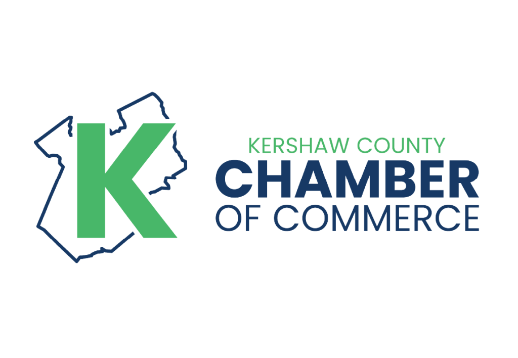
The Chamber’s existing logo leaned on a bold letter K inside a containing shape, a generic treatment that could have belonged to almost any organization. Paired with an over-bright palette, it read commercial rather than civic. The Chamber needed an identity that felt official, timeless, and unmistakably tied to Kershaw County.
The Strategy: An Identity Built From Place
We led from place. Instead of relying on a letterform, we built the mark around the actual shape of Kershaw County, giving the Chamber an identity that could only belong to them. That move also solved the real problem, stepping away from the enclosed-K construction that caused the commercial resemblance. Then we traded the over-bright colors for a classic, restrained palette, so the Chamber reads as established, credible, and civic rather than commercial.
The Results: A Timeless, Flexible Logo System
A clean primary mark drawn from the county’s outline, a refined and timeless color palette, and a flexible logo system developed across two concept rounds, built to hold up across signage, print, and digital.


LET’S TALK
Ready to become a case study?
Every brand here started with a conversation about where they wanted to go. Let’s have yours. Tell us where your business is today, and we’ll show you what it looks like to rise.